Blog
Designing a $500 logo that became a $4 billion company

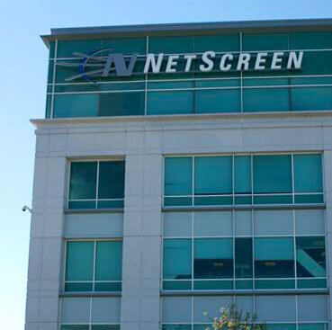
Years ago we designed a brand identity for a typical startup company with a small, unassuming office in an office park during our time in Menlo Park, California. The company, called NetScreen, had developed a firewall device for internet security. After completing the project, we filed it away with all the other startup companies we had worked with at the time. It wasn’t until years later when we drove by their new headquarters in Sunnyvale, California, that we realized our logo had made it big time.
We saw our logo displayed prominently on the huge, shiny, hi-tech building and were thrilled. As I was snapping photos, a well-dressed man who worked for NetScreen approached me and invited me to see the NetScreen Museum. The museum had our logo plastered two stories tall and displayed on everything from coffee cups to notebooks. It was an amazing and surreal experience, but unfortunately, it was short-lived. The company had just been sold, and they were taking down all the artifacts.
As I snapped photos of everything I could, I couldn’t help but feel like an anthropologist discovering an ancient tomb. The quiet and cold atmosphere was only broken by the sound of our footsteps. It was clear that the company was about to close its doors, and the employees were trying hard to land on their feet with a new job. However, my acquaintance from NetScreen was surprisingly upbeat, telling me that they had been bought for $4 billion dollars. It was then that I realized our little logo had helped grow the company to be worth billions. Perhaps we should have charged a bit more!
Check out our logo design portfolio to see many more of our brand identities and logo designs. Contact us to discuss how we can turn your startup into a 4$ billion dollar tech behemoth by simply designing your logo. 😉
Smart Design for Samsung Smartwatches

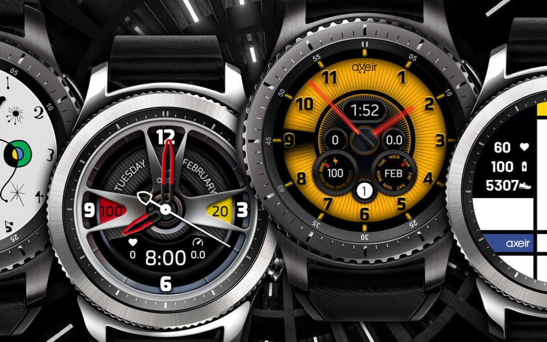
With Axeir, I aimed to create unique and innovative designs that would stand out in the market. My designs varied from artsy minimalistic to highly detailed themed watch faces. Each watch face UI had several levels of interactive buttons that revealed crucial data, such as heart rate, step count, current date, and much more. I dedicated myself to ensuring that each design was not only aesthetically pleasing but also functional, ensuring that my customers had the best user experience.
As time progressed, I expanded my offerings by creating a series of phone themes and wallpapers available for many of the Samsung Galaxy phones. I wanted to extend my creativity beyond the realm of watch faces and provide an all-encompassing visual experience for Samsung users.
Fast forward to today, I am proud to say that my interactive designs have been downloaded over 2,000,000 times and counting! It is overwhelming to see how my passion has turned into a successful business venture. With Axeir, I have been able to impact and enhance the lives of Samsung users worldwide by providing them with aesthetically pleasing and interactive designs that complement their devices.
If you own a Samsung phone or watch, I encourage you to search the Samsung Galaxy app store to see all of my amazing interactive designs or check out the brand website at www.axeir.com. With Axeir, I continue to strive towards creating innovative and unique designs that will stand the test of time.
Design Approach – From Pencil to Paper to Published
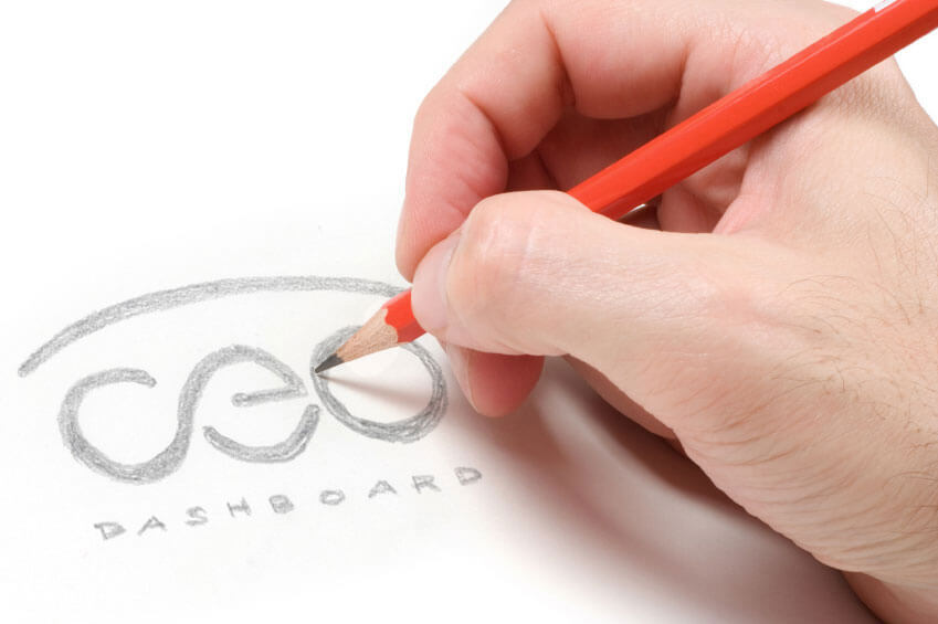
Good design starts the way our grand pappy did it, paper on pencil…. and of course a good trusty eraser. When you have only a pencil in your hand, the ideas can just flow without getting hung up on grabbing an anchor point and trying to tweak an arc with your mouse, or searching through every single font in your library looking for that perfect typeface. By first concepting with pencil on paper you can see if the true design works. You see the balance, the play of light and dark, how well the negative space works; no Photoshop filters, no backgrounds, stylized effects or drop shadows. You don’t have to be a good illustrator, you just have to have vision. When we design a logo, we often sketch as many as 40 ideas. These ideas can be random or inspired by something we saw. They can look like they were all drawn with your opposite hand, but somewhere on the page will be a few logo concepts that have potential.

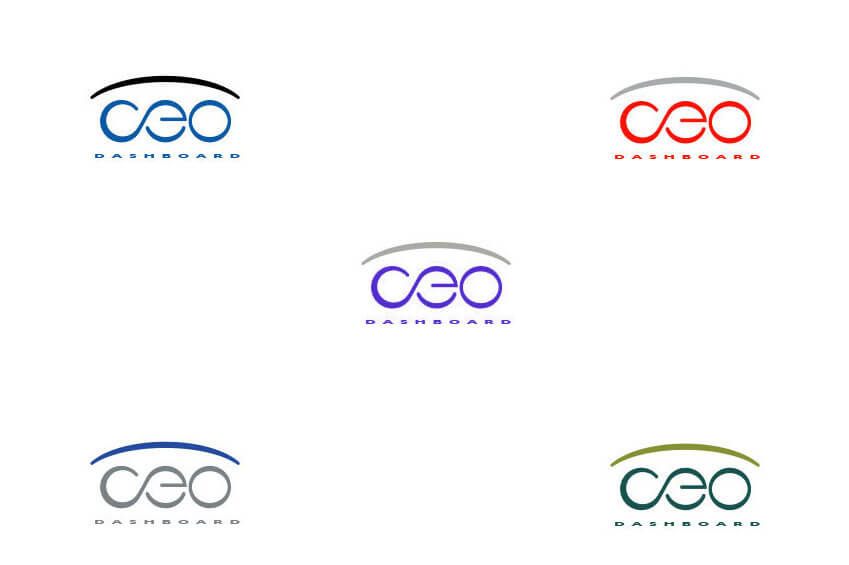
The next step is to scan your ideas that have potential and place them into a design program such as Adobe Illustrator. If we sketch 40 ideas, we can expect about 10 to be selected for this next round. Scanning your sketch is critical. If you simply look at your idea and try to replicate it on the computer, the balance will be off and often you will look at your computer version and think, something is not right. By using the drawing tools to trace your scanned concept, you will have a far easier time to truly transfer your concept into a digital format. Keep it simple at first. Work only in black & white so that you do not get caught up in colors and textures. Check to see if the design works at a small size. Nothing worse than finalizing a logo and then having your client say, “Great. Now I want to put it on a pen. If the design works at this point of the process, you know there is a strong chance it will work after you add color and possibly stylized effects. Generally only 5 of the chosen 10 sketches make it to the next step of the process.

Color is what gives your logo brand an identity. It generally is the first emotion you feel before you even know what the logo stands for. Do some research as well as some consulting with your client to ask about colors, likes and dislikes. Certain cultures have a strong opinion about specific colors and the meaning they carry. Do your research beforehand. You don’t want to have a great logo concept rejected only because the client hates purple. Try the same logo in different colors. It is surprising how different of a feel you can get from a red logo versus a blue logo.
After you have chosen color options for your logo concepts, be sure to print them out on separate pieces of paper. This will give you a chance to see the logo on it’s own, without the influence of your other logo designs. It also gives you a chance to see the logo in a natural environment. Toss it on a table with a few magazines or even the day’s mail and stand back a few feet. Take a break and come back in 15 minutes. How does the design feel? Does it give the right vibe? Will it stand out when lying around with competing collateral.
At this point the goal is to have 3 strong logos to present to the client. We like to take the approach of showing a conservative logo, a “middle of the road” logo and something a little crazier. The logos you present will be the start of the discussion and also the beginning of the revision process. Typically, a client will choose one of the options but may also like certain elements from the other options. The next phase is to revise and possibly show 2 to 3 new logos based on the chosen design as well as the client’s feedback. Options could be based on color, font selection, weight or even orientation. It is surprising how different a logo will feel if there is an icon that is stacked vertically on top of a word mark than it would be if it was to the side.
This general approach from pencil & paper to production is not just for logos, we take this approach to every project we work on – logo design, website design, even brochure design.
Remember, keep those initial sketch drawings to your self even if your client claims to have “good vision”. Moat likely they are just trying to save a little time ($$$) with the process. And, never toss the sketches even after a project is completed. You would be surprised how many times a rejected sketch for one project is reincarnated for another project and becomes one of the selected options.

Recent Comments